Initial Ideas
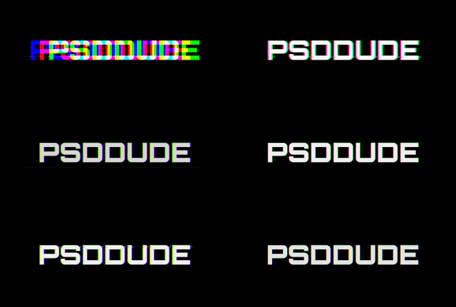
Our initial idea for a typeface, for our Action film opening, is a typeface that is capitalised and striking but is evidently representative of the action genre from its appearance. The reoccurring motif of 'coding' that will feature in multiple shots, emphasises the secretive nature of the hidden governmental plans; metaphorically speaking Hayden (the protagonist) is the fault in the government's hidden code. This, therefore in-sighted the idea that the typeface should mirror this 'fault' which would have an appearance that is 'jagged' and with a significant 'glitch' effect. Upon research on typeface's using the keyword 'glitch', we decided on the typeface "Hacked Title". This is particularly effective as it's capitalised and relatively large kerning distance between the letters creates a dramatic appearance as it elongates the time taken to read the title. It also takes up more space on the screen when superimposed. The jagged serifed edges with horizontal lines aligned to one side of the letter sticking out, or areas within the letter itself missing segments of the side.
How we will achieve this:
We hope to achieve this text style by using a 'prism' preset and adapting the extent of the movement of the text using a 'ripple' preset, by modifying the key frames; we will add new keyframes in quick succession in order to create a coherent piece of animation. This will appear after the blackout (with fade to black transition) and gunshot sound, in order to build tension and entice the audience to want to continue watching.
Throughout the opening scene, credits will appear superimposed on top of the visuals, however the text will appear using a fade transition, aligned at varying places within the frame. We will use the same typeface as used before ('Hacked" Title).


No comments:
Post a Comment